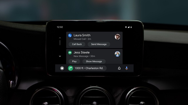
Google is rolling out a redesign for its driver assisting mobile app — Android Auto — with a default dark mode, colourful accents and readable fonts to the app which, the search-engine giant thinks, would fit better with modern automotive interiors.
“We’re evolving Android Auto’s design to fit in better with your car’s interior.The new app interface is built to help you get on the road faster, show more useful information at a glance and simplify common tasks while driving,” Rod Lopez, Product Manager, Android Auto, wrote in a blog-post on Monday.
Launched in 2015, Google’s Android Auto was made to mirror features from an Android device to a car’s compatible in-dash information and entertainment head unit.


